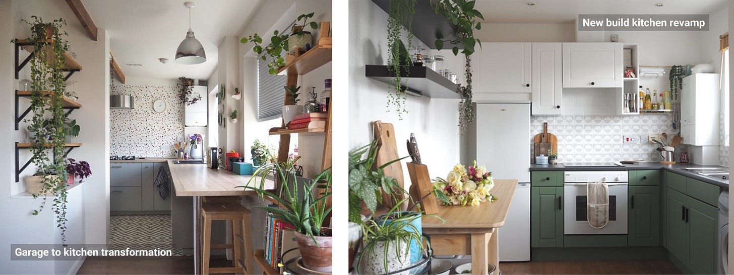
Looking back at the homes I lived in, it somehow seems it has become tradition that I would makeover the kitchen in every single one of them. Okay, maybe not in some of the rentals, but in my London home the garage became a kitchen, and in Newcastle I transformed a standard new build kitchen to a bright and modern space you actually want to spend time in. But my love of kitchen makeovers (and interiors more generally) was actually sparked long before I started documenting my projects online. It was when I found myself renovating my parent’s kitchen in my childhood home in my teens. Without any prior experience or training, but with bags of enthusiasm and passion, I went from styling my own bedroom with images cut out of magazines, to planning, drawing, sourcing and building a full functioning and practical space, which has withstood the test of time and is still in use today.
So I guess it was not a big surprise that the kitchen would be something I’d be dying to tackle first, moving into my current home. After all, who am I to break my own traditions, right?
Around six months ago, I posted about my kitchen makeover plans, which concentrated mainly on the updates I cloud DIY. This included updating the cabinet fronts, the backsplash, as well as the worktop. Furthermore, I would change the cupboard handles and disguise the appliances. Simple. What this plan did not mention at the time however was that before I could even start with the presented budget friendly makeover, a lot of groundwork was required. Not so simple. This included dismantling the ceiling, fixing the walls, and installing some new lighting. All this was in the original plan of this kitchen makeover, but the work had to be done in stages. Why? Well, mainly for budget reasons, but then there’s time to take into account as well. The former was because I could not DIY the groundwork required all by myself, and the latter was because doing up a house as a single individual, while holding a demanding full-time job, trying to have a social life, and squeezing in a bit of rest, is basically a constant juggle. Modern real life you’d call it these days, I heard.
Now, while writing this reveal, not six months, but two years (!) after I initially started the project, I thought, it may be quite useful to talk you through the whole journey this kitchen went through, starting with …
The groundwork, the less budget friendly part of the renovation. I really hope this will not be required for your project, but if it is, hopefully you’ll find some learnings and inspiration to take away. Then follows chapter two of the kitchen story, if you like, …
The budget makeover. This is for you if you’re not planning a complete refit of your kitchen, or should part one, the aforementioned groundwork, have swallowed up all your savings and kitchen dreams. I hope this part will show you that you don’t need to despair, it is still possible to create a well working and beautiful kitchen, with whatever funds you have left. Trust me, I’m speaking from experience.
Now then, let’s go back in time…
The groundwork
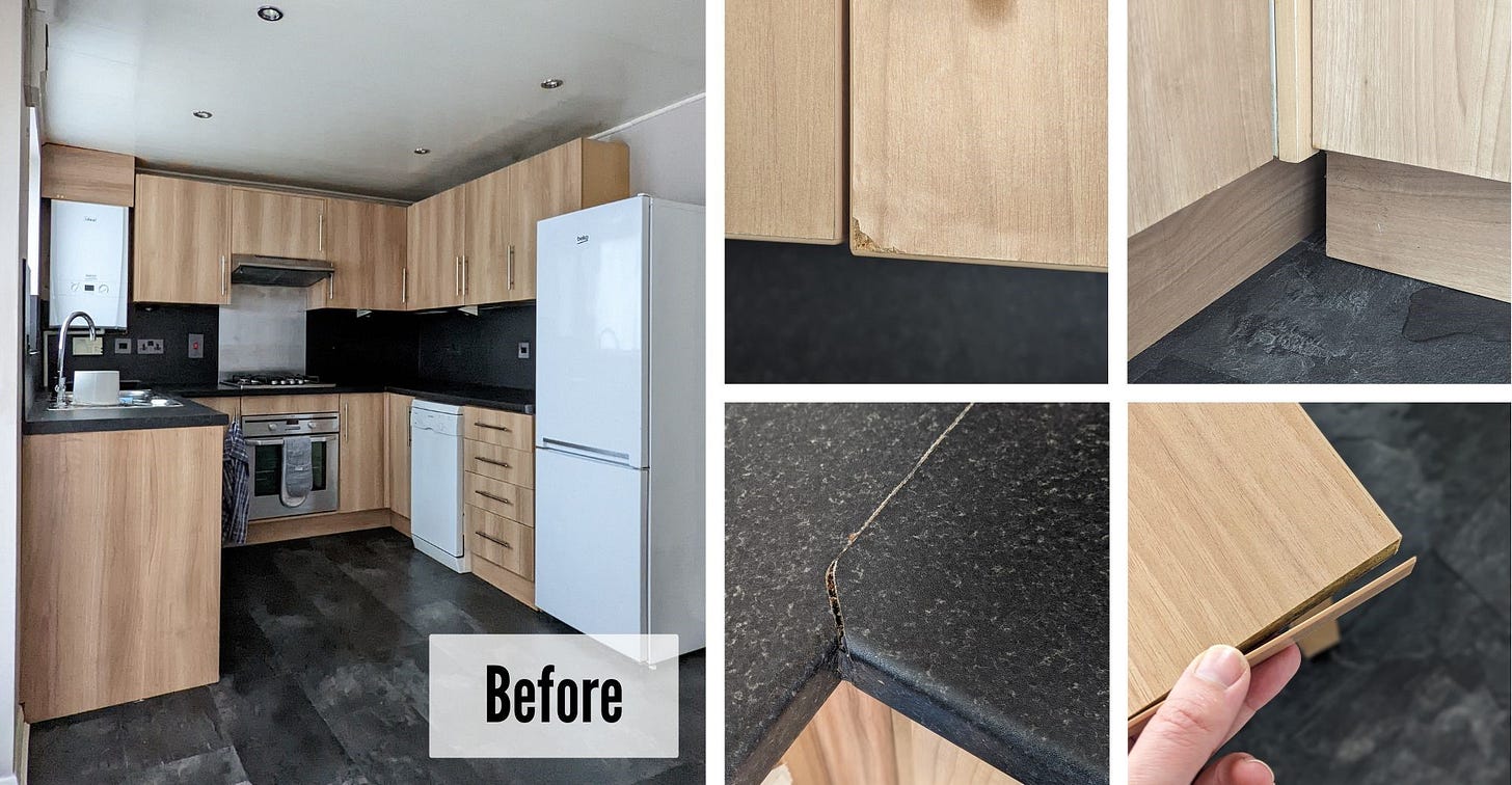
Moving into this home, I knew the kitchen would be the space that would need the most amount of work and investment due to the groundwork that was required, before I could even get to the actual makeover I was envisaging. The cupboards themselves were perfectly fine, which was a big bonus, but the ceiling, walls, as well as the lighting, all needed attention.
The ceiling
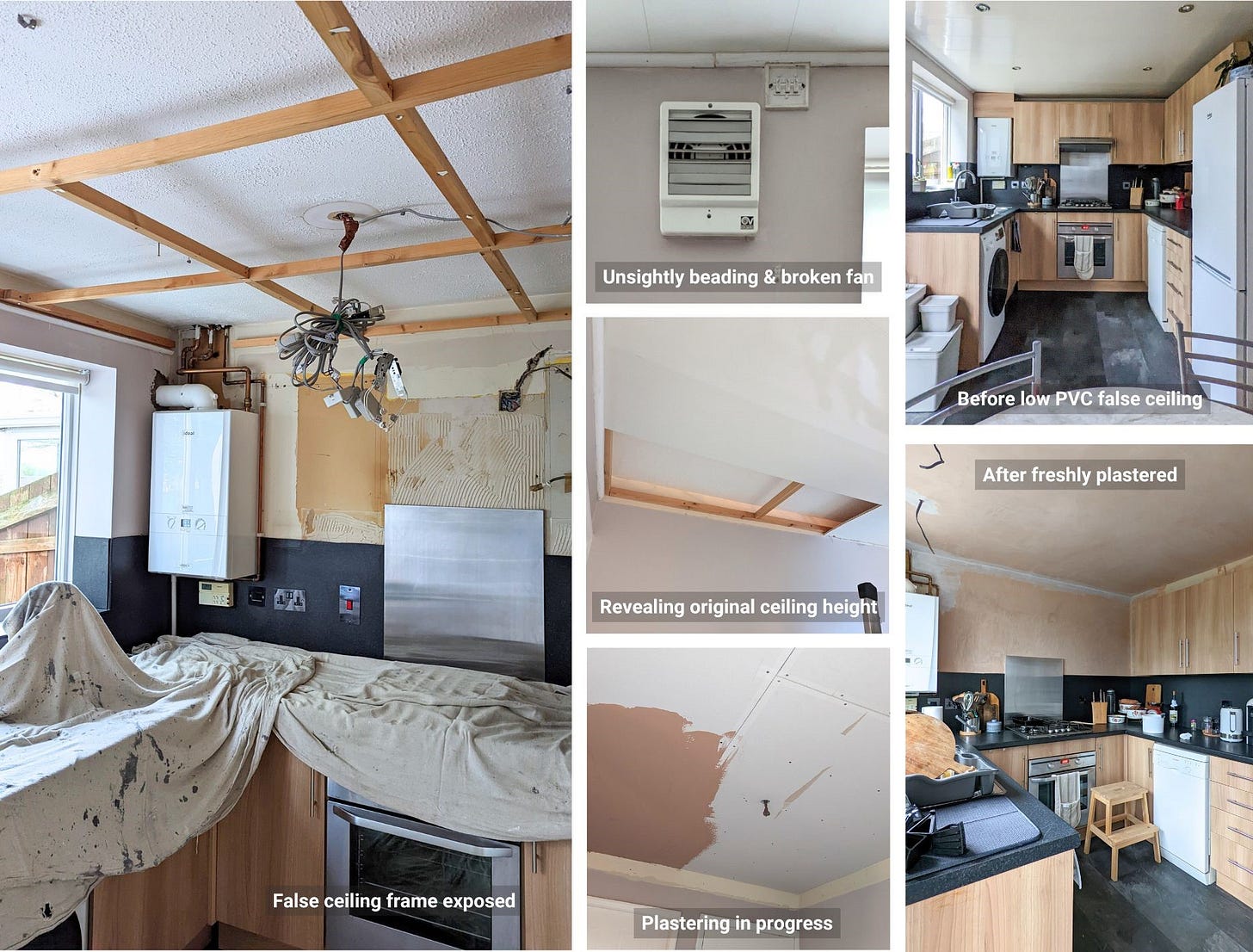
You can see on the images that the original ceiling was made of some PVC plastic ceiling cladding. It is not something I would choose to fit, though a few months back shiny gloss ceilings (and walls for that matter) seemed to make a comeback, briefly. Anyway, the look of the panels to one side, what did concern me more was the way the ceiling was fitted and its wear and tear. I could see it drooping in places, panels coming apart, and some dark staining showing around the downlights. Not to mention the quite unsightly beading fitted to finish off the edges, which somehow ended up right in the way of the extractor fan switch, which in turn was missing its cover plate. This however did not matter, as the fan itself was broken. Can you hear the dominos falling?
On closer inspection, and with the help of my lovely joiner, we discovered that the ceiling was in fact a false ceiling, installed approximately 20 cm underneath the original ceiling, thankfully still intact, to accommodate the ancient halogen downlights. This was not an unusual setup, considering the type and age of the downlights. Needing plenty of air circulation, due to the extraordinary amount of heat these produce when switched on, these downlights could not be built into the original ceiling. What was an usual choice, was the ceiling material mixed with these power-hungry downlights. The dark markings I could see were in fact burn marks, caused by years of the plastic being exposed to the hot metal of the lights. Scary. Dangerous really. All this definitely had to go.
The lighting
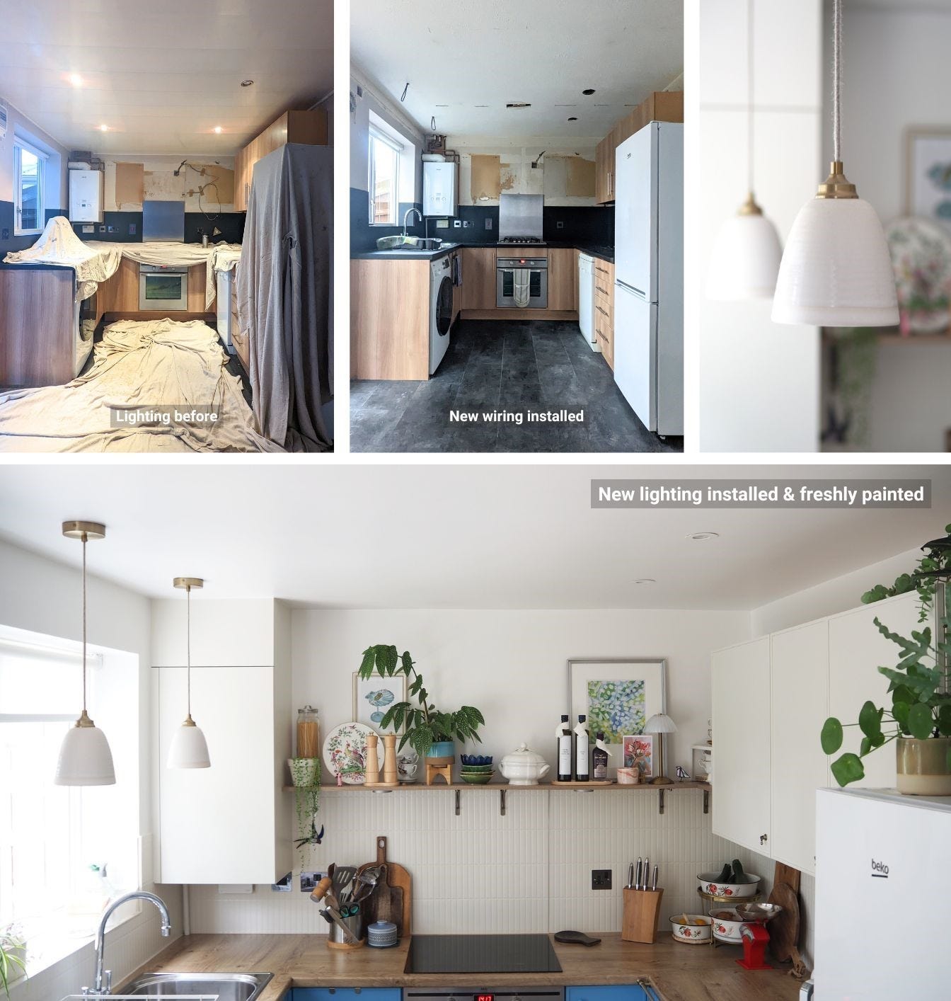
With the shiny false ceiling and old lighting gone, I had a blank canvas from which to create the new lighting scheme. I assessed the layout of the kitchen, how I would use the space, but most importantly how I wanted it to feel. All this informed my vision of a kitchen that would join the other rooms of the house in providing the feeling of cosiness, and be a space that feels a bit less like a kitchen, but more like an extension of the living areas.
Of course, without starting afresh and spending thousands of pounds on designer units with all integrated appliances, it is impossible to make this kitchen look less, well, kitchen-y, but one way to at least move away from a traditional kitchen feeling is to adjust the choice of lighting. So rather than installing a traditional symmetrical grid of downlights throughout the room, I reduced these to only two recessed downlights above the main worktop area, and introduced pendant lights to the rest of the space, one above the dining table, and two smaller ones around the sink area. All are individually controllable and dimmable too, to create even more comfortable and cosy lighting levels.
The walls
Removing the false ceiling did not only reveal the original ceiling, but also the original piece of wall above that false ceiling. Over the years, this part of the walls has, understandably, not been treated with the rest of the walls, creating quite a visible and uneven transition which needed to be balanced out to avoid the false ceiling line being visible once the room was freshly painted. Little did I know that some of the paint as well as plaster in the room was blown and would peel or crumble off the walls as soon as I started filling and sanding.
The plasterers, contracted to plaster elsewhere in the room, having long completed their job and left, the fixing of the newly damaged walls was left to me. Luckily having done a crash course in plastering while helping a friend a little while ago, I was not a complete novice to the task, but this would still be the first time plastering without help. Countless hours later of filling, smoothing (probably not a technical term), sanding, re-filling, and re-sanding, the walls were as smooth as I could get them, and ready for painting in my favourite shade of warm white: Flint by Little Greene.
The storage
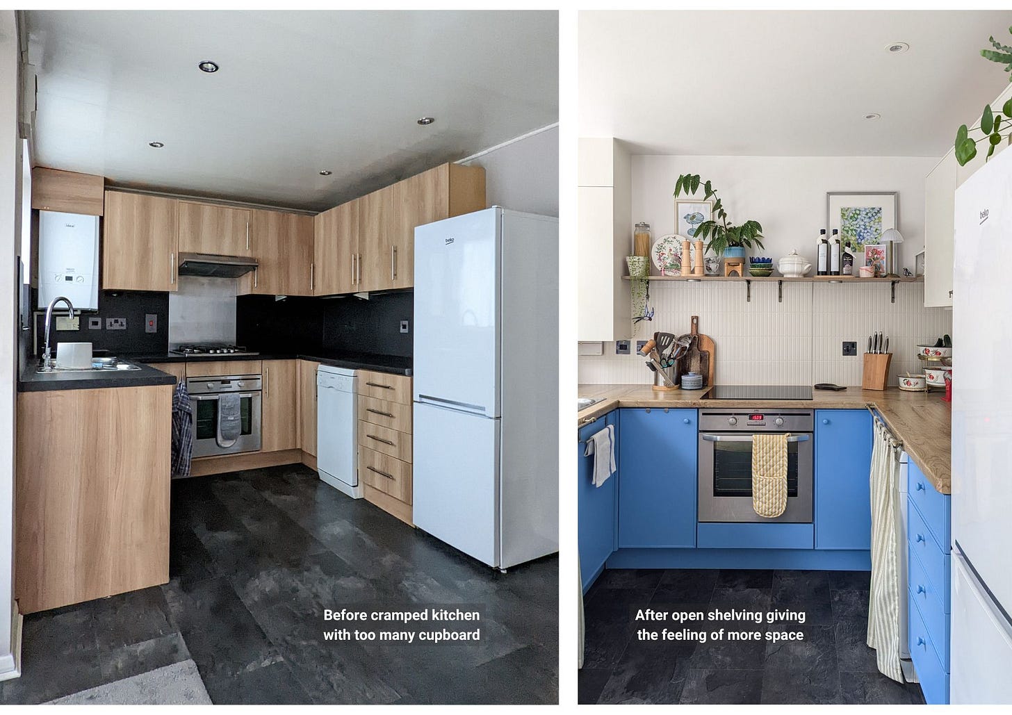
Quite early on in the process, I decided to make a possibly controversial layout change in this relatively small space, where storage is at a premium. The problem, every bit of wall in this kitchen was filled with countless cupboards. Together with the lowered ceiling originally, the space felt cramped and rather dark.
To make this kitchen feel more comfortable, spacious and light-filled, I asked myself my standard questions: What will I use all the cupboards for and do they work for me where they are? The answer was no. Standing by the hob and cooking, with the cupboards and extractor hood seemingly looming over me, was simply not a nice feeling in this particular room. I felt trapped and that I had limited space to move. Additionally, once I moved in and filled the units with all my belongings, I realised that all the cupboards above the hob we surplus to requirement.
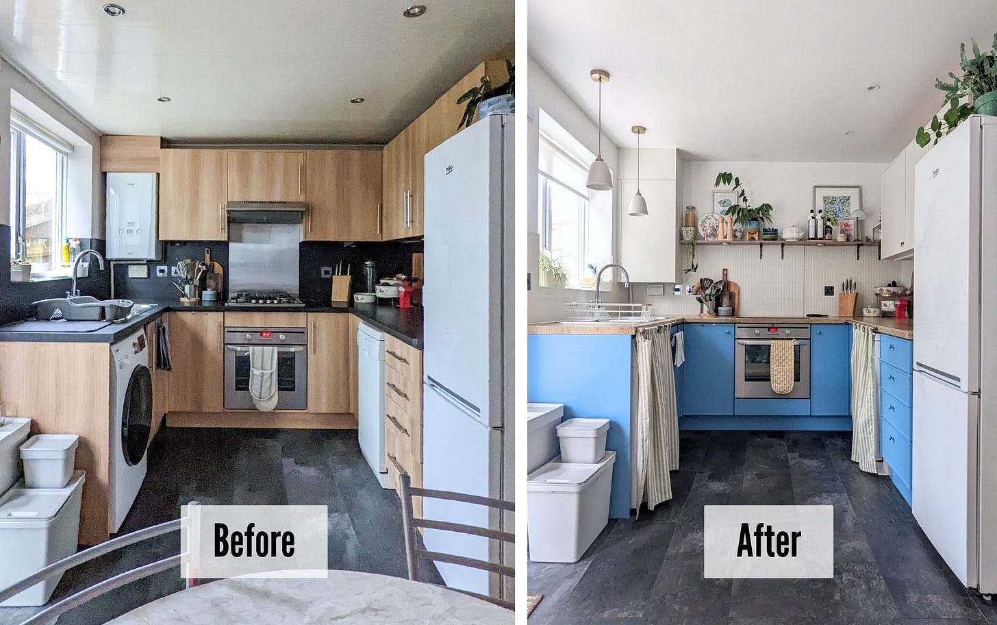
So it was a painless and fairly quick decision to replace some of the top cupboards with open shelving, which would ensure that I am not losing all of the storage, while creating the feeling of space and cosiness, and allowing a bit more light into the cooking zone.
The budget makeover
Fast forward around 15 months. During which I’ve been finalising the kitchen makeover plans, purchasing items for the renovation whenever I could get my hands on a bargain, but also saving and spending the rest of my cash on fixing and installing things around the house that were needed but will forever stay invisible. Finally, March this year came, and I was ready to start the kitchen renovation’s eagerly awaited second act.
The concept
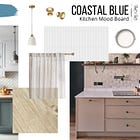
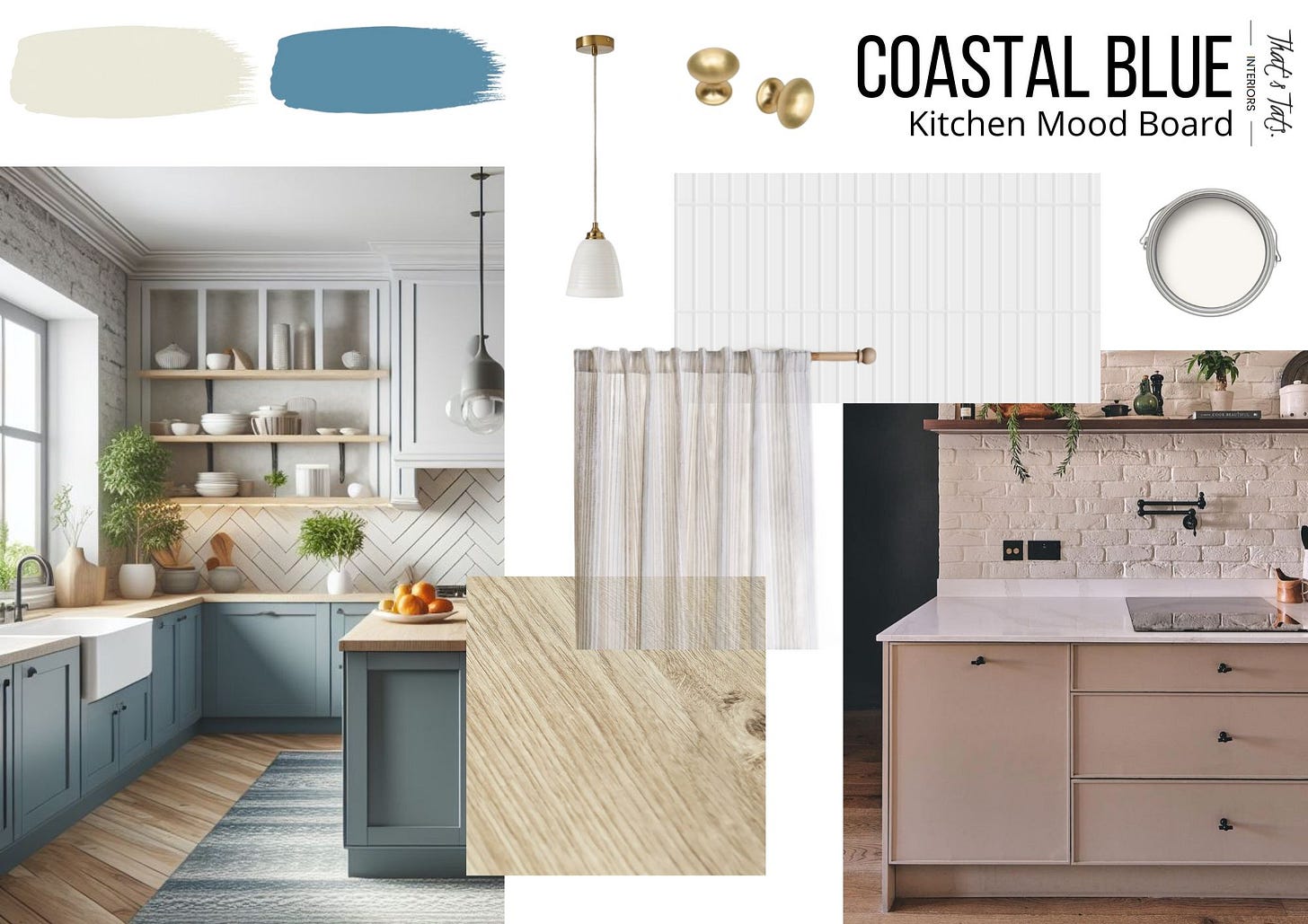
Here is a little reminder of the original plan for this project. As you will see below, other than a couple of smaller tweaks, which is normal for any project, what you see here has pretty much come to life as envisaged. This is always great to see, because even despite meticulous planning, sample selection, and endless visualising, you never know if the concept, in its entirety, will work in reality exactly how it was imagined for the space.
The cabinets
While I was looking for my new home, a modern take on the traditional shaker style cupboard fronts caught my eye. Here a very thin strip around the edges of the cupboard fronts replaced the thicker, more traditional, edging known to be the shaker style. As soon I saw the very plain cabinet fronts in my new kitchen, I knew that this is exactly the detail needed that would elevate their look.
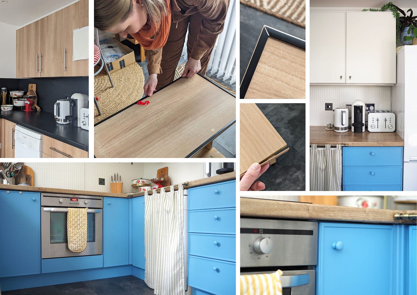
To achieve the edging, I was considering using thin wood strips and attaching them with grab adhesive. This would have worked perfectly, I am sure, but as soon as I calculated the amount of wood I’d need to cover all the cabinet fronts, I had to find a more affordable solution. A quick search on Amazon and I came across a flexible vinyl moulding trim, which was sturdy enough for the purpose, already had a strong peel and stick backing, and was relatively easy to cut, though much easier with some mitre shears for sure.
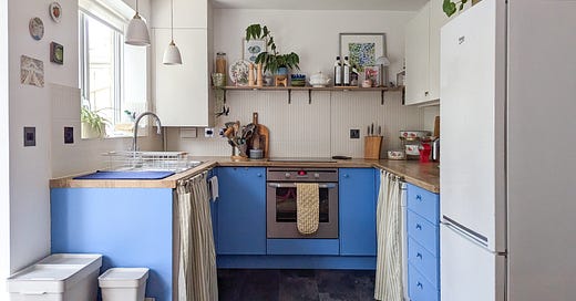
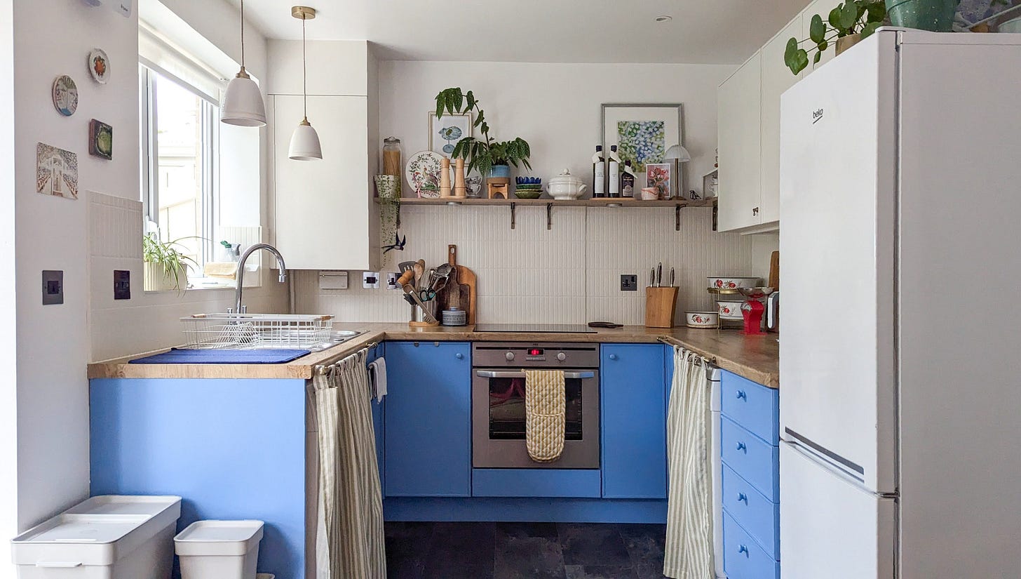
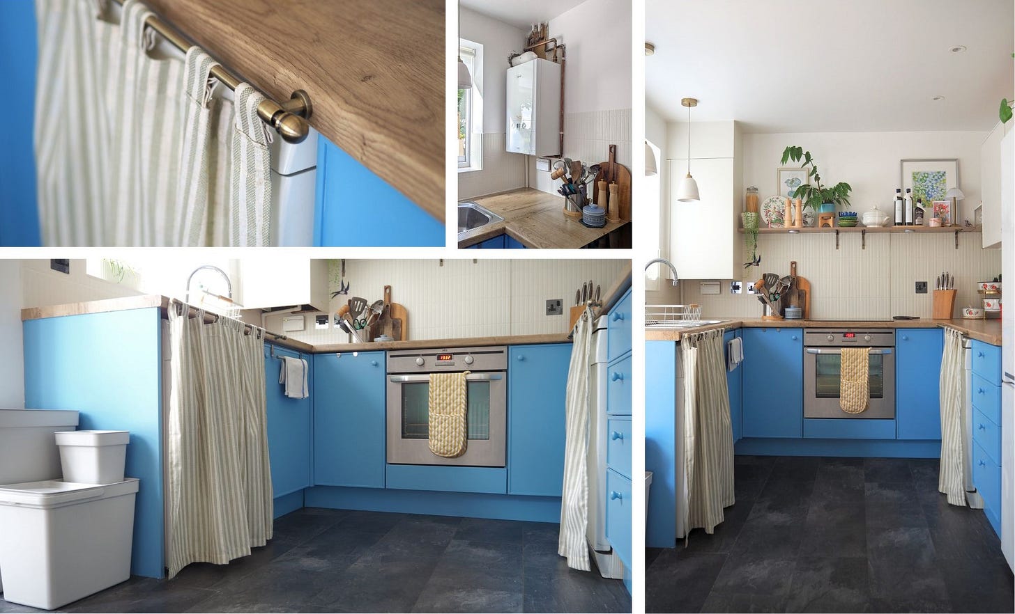
Once all the trim was installed, I caulked the edges where needed, and got on with priming and painting the bottom cabinets in this lovely ocean blue by Little Greene called Tivoli, and the top cupboards in their calming Portland Stone Pale. Both were colour matched expertly by the trusted Decorating Centre Online, as this is a budget renovation after all.
The worktop
During the kitchen revamp in my last home, I didn’t go as far as updating the worktops, as these were in perfectly good condition and generally suited the home, where you would find a few dark accents throughout. However, in this home, with the coastal and light-filled theme I had in mind, I could not see myself using any dark colours. Furthermore, sadly the worktops were also showing some quite visible wear and tear, and simply had to be updated.
Restricted by my budget and considering the environment, replacing the worktops wasn’t a viable option. I have to admit, even if it would have been a suitable solution, I was actually also always quite curious to see what it would be like to upcycle worktops with vinyl film. I wanted to try this for a long time and make my mind up if this is indeed the viable long term solution it is made out to be.
I am a big fan of oak, which works perfectly with my coastal theme. But I am not a huge fan of fake wood, so I was torn for quite some time about my choice of worktop finish. In the end, the vinyl by d-c-fix in Ribbeck Oak convinced me to give it a try. In a future article, I will go into the process of fitting the vinyl and my ultimate verdict of using it for a worktop upcycle, but I can say for now, surprisingly, I don’t hate the look.
The splashback
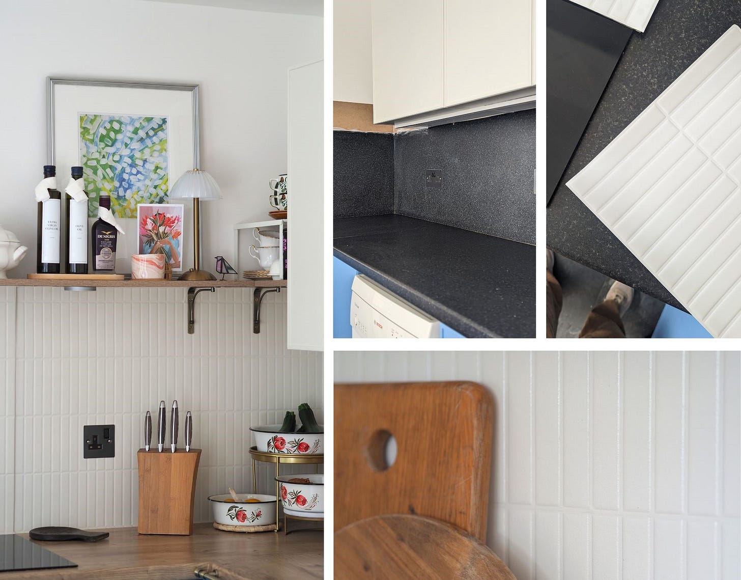
This new kitchen is relatively small, and with the bold colour on the bottom cabinets, which are filling three walls of the space, a patterned splashback would have been too busy, making the space look even smaller. However, reducing pattern does not mean reducing texture, and Kit-Kat tiles would be able to balance both of those aspects. These are thin tile strips stacked either vertically or horizontally, providing quite a lot of texture, while having a sleek and modern look.
Considering the budget and the amount of wall space I needed to cover for this makeover, the eye-watering prices of these tiles made sure that the real deal was not something I was able to install. So of course, I first considered stencilling this tiled look, but I could not find a suitable stencil, and would not have been able to recreate the texture I was craving for this splashback. After a while, I came across the perfect self-adhesive tiles however.
Approaching this solution with the same scepticism I did the wooden vinyl worktop, I had no other choice than to try, and how wrong I was. The look and feel of the tiles, once painted in Portland Stone Pale to match the cabinets, did even fool my carpenter, who thought he would not be able to install the shelves, not having brought a drill bit suitable for tiles. Only time will tell how well this splashback solution will withstand the test of time, but for now, it's looking really great.
The detail
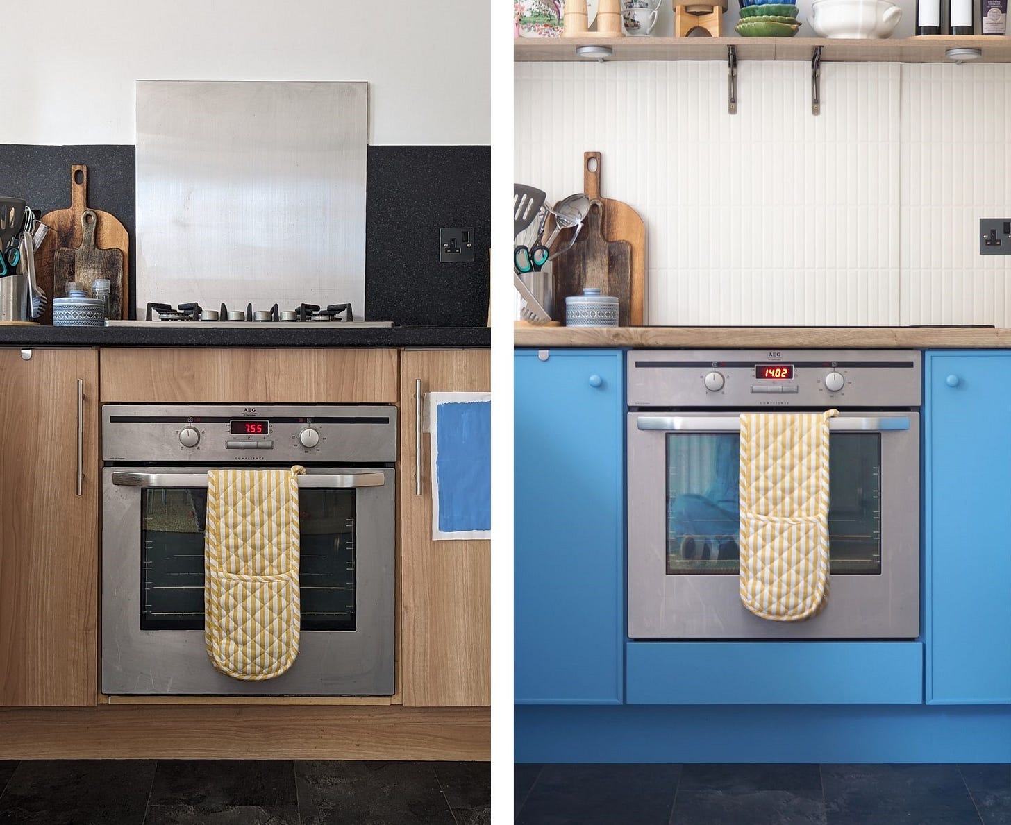
Moving the oven. The oven has been in an unusual position originally, located at the bottom of the cupboard with a cabinet filler piece above it. Usually, the oven would sit at the top of the cupboard, with the filler piece below. Other than this setup feeling odd, and taking away extra storage space at the bottom of the unit, this seemingly small height difference makes using the oven very uncomfortable too, as it requires you to bend down lower than is usual to access oven contents. This simply had to be put right, even if it meant moving the gas pipe feeding the gas hob.
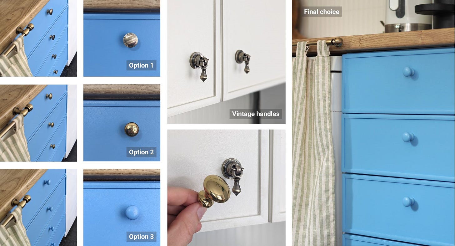
Obsessing over the choice of handles. The choice of handles for the top cupboards was made long before I started this makeover, as I knew I wanted to use my vintage handles I saved from the London kitchen makeover. The choice for the bottom cabinets was not as straightforward sadly. If you’ve been following the makeover progress on my Instagram, you will have experienced my absolute indecision. Originally, I planned to install aged brass handles throughout, but it was difficult to match the colourway of the vintage handles. When I finally did, they were contrasting too much with the cabinet colour, and as a result made the whole kitchen look very busy. So, to keep things simple, I settled on installing cottage style wooden handles, painted in the gorgeous Tivoli blue to match the bottom cabinets.
Disguising the appliances. My preference in kitchens is to always house appliances built into the cupboards. I’ve done this in the London kitchen and it just looked so smart. But this is of course really mostly possible if you start a kitchen from scratch, which was not the case for this makeover. So other than being able to box in the boiler, the solution to disguise the under counter appliances was to install cabinet curtains. This look does not suit every kitchen, as it does require a more relaxed look and feel of the space, which is exactly what I wanted to achieve in this kitchen.
And that’s it. Two years in the making and I couldn’t be happier with the end result. It feels as bright and spacious as I hoped, and I look forward to hearing what you think.
I read, respond to, and hugely appreciate every comment, like, and share/restack. Not only does your feedback make my day, it also makes an enormous difference to the visibility of this article. My hope is that it may be helpful to as many people as possible, and so I hugely appreciate you taking a brief moment to support my work, so it can be found by others. Thank you!
You may also be interested in
Handy kitchen design tips less frequently talked about
Given I am knee-deep in making over my kitchen (catch-up with the progress here) and given that I am not yet able to share the final result, because as always things take far longer than anticipated and, as is typical for me, I am of course adding little design changes as I go, but I thought I’d still stay on topic for this month’s blog and provide you …
DIY Terrazzo Splashback
Tiles are certainly the go-to when it comes to choosing a splashback and for very good reason. They are durable, they can withstand heat, they are easy to keep clean, well, most types are - hello encaustic beauties, why do you just have to always come unsealed? But then, tiles can also be expensive, and there is grout. The latter meaning, whatever patte…
House to home without renovating
It is very rare that a new house, whether rented or owned, is feeling like your home when first moving in. There is a small chance that you may get lucky and find a home that already has your style, the wall colours are exactly what you like, the floors are what you would have chosen, and so on. I have not yet come across this home. But then it is also …






What a difference! It looks amazing - great inspiration for me and my kitchen. Thank you 😊
You always do a great job - didn’t realise you moved the oven too !