Our homes have been slightly redefined in the last couple of years. We have certainly been at home much more, and though our homes have always needed to be multifunctional, the type of activities requiring a more comfortable space have shifted, such as the home office. With working from home being rather a given now, for some of us this is a permanent arrangement, for others, same as myself, a semi-regular affair. Nevertheless, the increase in regularity of requiring a space at home from which to realise video calls and tap away at your keyboard for hours on end, a simple lap tray won’t cut it any longer. A more comfortable setup needs to be arranged, including a decently sized desk and comfortable chair at the least.
But where do we usually find a space for those things in the average UK home? Well, in a moderately sized two bedroom apartment like mine, it could be in any one of the many multifunctional spaces, and I’ve chosen it to be the spare room. The room which has been dedicated to welcome guests, provide some form of extra storage, serve as an office and design studio, and more often than not, accommodate a drying rack or two, full of freshly cleaned washing. A perfect combination of purposes. What could go wrong.
Well, here’s the reality. Despite having been working from home for months now, and having a desk and office chair waiting in the spare room, I found myself at the dining table, in the reading nook, or on the couch, using that dreaded lap tray, while my washing, and all the random items without a proper home, seem to have permanently moved into the spare room. The result being, the more time progressed, the more my posture was affected, and I started to feel like the walls are closing in, or that I’m living in one room, rather than the 2 bedroom apartment I’m paying for. Then, when guests were finally allowed to come and stay, I died a thousand deaths, first trying to clear the room and then thinking of them having to spend a night there. I couldn’t imagine a less inviting and confusing space to stay on vacation.
So, going into the new year, and taking advantage of that new-year-new-everything enthusiasm, I set a goal to transform my office/guest room and make it a space anyone would want to spend their time. To get there, I first needed to unpick the reasons why I myself, and almost certainly my guests, have been naturally drawn away from this space.
The before
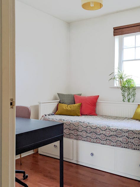

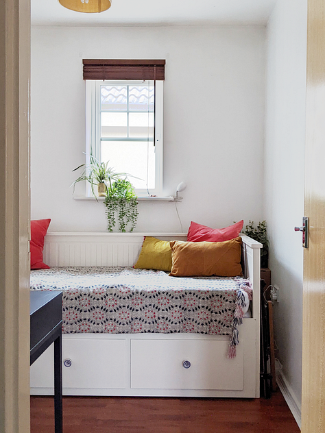
Looking at the room in its original state, it didn’t really come as a surprise that the main reason for me avoiding working in this space was its quite bare, bland and boring state. I am someone who is excited by colour, texture, and variation. So a white box with two pieces of furniture simply wasn’t cutting it, and that despite me trying to make things feel more inviting by adding colourful cushions and a few plants.
Another reason I hardly found myself spending time in this space was the light. It is a north-facing room, which simply only gets little natural light, and the light this room does get is more often than not cold and needs to find its way through the relatively small window overlooking a neighbouring wall. Not ideal, but also not really anything I could do to change that, as fitting a bigger window or demolishing that neighbouring apartment block was not an option. A challenge, this one.
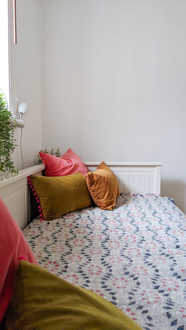
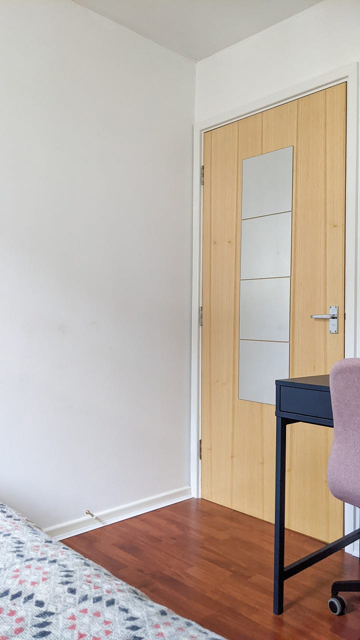
And lastly, seeing things through my guests’ eyes, I could imagine them not enjoying their time in this room due to the lack of comfort and storage. The room didn’t feel cosy and didn’t give anyone even only peeking into it a welcoming hug. There was nowhere to put your glass of water or charge your phone next to the bed. To switch off the light you had to get out of bed, and well, clothes storage was also non-existent, so guests had to keep their belongings in their suitcases.
But all this is no more and here’s how I transformed this multi-functional space into a welcoming, practical, and fun creative space and guest room.
The layout
There were not many options to play with here in terms of layout, but knowing this being the foundation of a successful room design, this area definitely needed attention. Placing the daybed onto the wall parallel to the doorway made the already small room feel even smaller, as the little bit of floor and circulation space was visually and practically reduced. Additionally, the access to the window was blocked, which could only be opened, or looked out of, by climbing onto the daybed. But by simply swinging around the daybed 45° against the wall to the left of the window, and by relocating the desk to the opposite wall, suddenly created this much longer walkway within the room, allowing you to experience the full depth of the room, resulting in this sudden feeling of space. Additionally, the new layout allows you now to get to the window easily, and due to the angle in which the door opens, the desk can even be hidden from view, on days when it’s particularly messy.
The colour and pattern
I love clean white rooms, but given this one is north-facing with a small window overlooking a neighbouring wall, it was unfortunately not looking as clean and bright as intended. The hue was rather on the greyscale, making the room appear gloomy and dingy. But how can a north-facing room be brightened up? Well, white can work, but only ones with warm undertones. However, it will always be very challenging to brighten a north-facing space, especially when quite small, by painting it all white. This colour simply needs natural light to bounce the same around a room. So other colours have to come to the rescue. Anything ranging from warm neutrals, happy sunny tones, jewel-like high pigment colours, through to even greys, but the ones with yellow or pink undertones, are all good options.

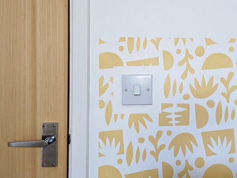
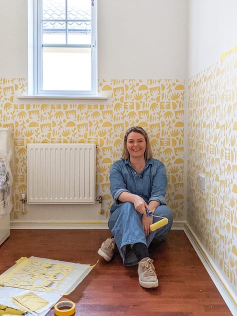
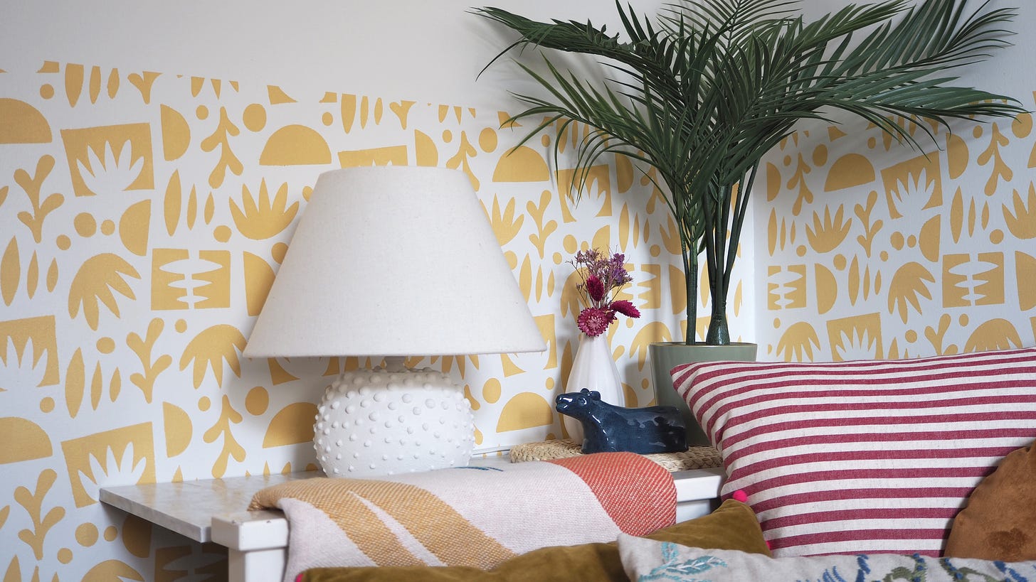
Now, staying in keeping with the rest of the apartment, and continuing the light, airy, but colourful and playful feel, out of all the available options, a mixture of white and yellow felt like the perfect combination, but in which proportion? I strongly sensed that a full block of colour on the walls in any combination would simply lay too heavy in this small space. So I needed a pattern, and suddenly remembering Sarah Sherman Samuel daughter’s gorgeous bedroom and that beautiful Matisse inspired wallpaper, I knew I’m on to a winner here. Having something similar on half the walls in Farrow & Ball's Yellow Ground on a base of Little Greene's Flint warm white was my vision, which did finally come true after scouring the internet far and wide for the most affordable option - a hand painted pattern created by the help of CreateCut’s stencil ‘Funky Shapes’. I have written all about my stencilling adventure in a previous post.
The design details
Now the base of the room is done, onto the interior décor, where each element needed to be carefully considered to continue the overall design concept, while balancing practicality and making sure to not overwhelm the small multi-functional space.
The space-creating mirror
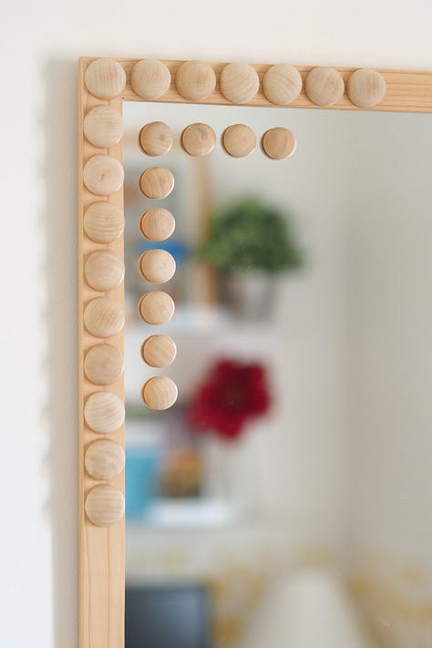
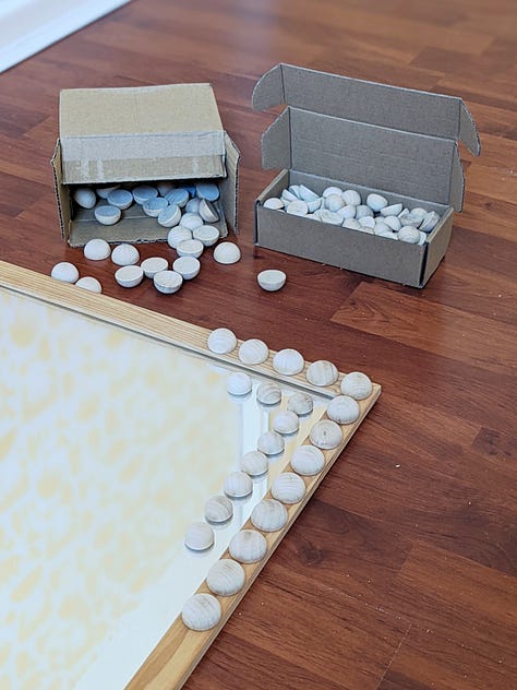
The one item which instantly adds a feeling of space to a room if placed in the right spot. In my office/guest room this seemed to be on the opposite wall to the doorway, where it could reflect and enhance the light coming from the window, and be seen every time you walk past the room. This mirror had a home in the hallway previously, before its recent renovation, but after giving the mirror a little makeover by adding half beads, it is now referencing the rounded shapes on the wall and textures on the soft furnishings. Hence, it is definitely looking much more comfortable in its new home now.

The multi-functional bedside
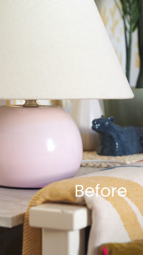
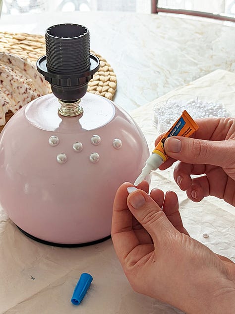
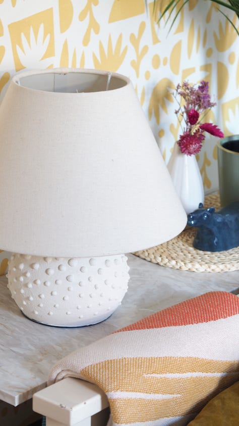
Spending a night in a room and not having a space right next to the bed at a comfortable height to put your glass of water, book, glasses, or where to charge your phone, is my number one pet hate when it comes to bedroom comfort. Thinking that my guests may feel similar, some form of bedside table was required. Given the size of the room challenged convention here, I had to think outside the box by utilising the space between one side of the daybed and the wall. This was primarily planned for storage, until I realised it was also perfect for a little custom shelf. DIYed out of MDF covered with marble effect vinyl, it is now blocking the view of my bulky drawing board, while adding that beside table comfort, and even being big enough to comfortably accommodate my upcycled reading light, another must-have in close proximity to a bed.
The cosiness-inducing décor
Echo, cold floors, and too many hard surfaces, are the biggest killers of comfort in any interior space. You want a room to feel like it is giving you a warm and quiet hug, which can be instantly achieved by adding items such as curtains, cushions, throws, or rugs. Though the former cannot be found in this office/guest room makeover, as the window is simply too small to be covered by a curtain, it is bursting with all the other cosiness-inducing décor. I have certainly not skimped on cushions, which ensure you want to sink into that daybed, but the rug is probably the one deserving a particular mention due to its multi-function. Not only does it ensure anyone getting out of that daybed, isn’t placing their bare feet on the cold floor, but its round shape does also add interest, where its compact size allows it to not obstruct the door or movement of the office chair, especially this one here on castors.
The space-saving storage
Last but not least, storage is always a struggle in a small multi-functional room, so space-saving and light solutions are required. In this room makeover, I’ve already utilised the spare space next to the daybed, but what about all that wall space above the desk, and guests also still don’t have anywhere to hang their clothes.
In terms of over-desk storage, there are so many ingenious options available, ranging from various types of notice boards, to shelves, and the latter was of interest to me. I was over the moon when I spotted these transparent MELLÖSA picture ledges in the loft. I never ended up using these in my previous home, but they seem to have been waiting for their moment. They are perfect for this space: light, not obstructing the view, and making all my various bits and bobs that inspire me, magically float in the room. Onto the last piece of the puzzle, hanging storage for guests, where the solution was a no-brainer for a peg rail lover like myself. It is simply one of the best storage solutions, which can fit into the smallest space, such as here, neatly tucked away behind the door. A peg rail is also super easy to DIY. I made mine for instance out of a scrap plank of wood and pegs I had left from the hallway makeover.
Well, and here we are, a room that was gloomy, bland and made everyone run a mile, but which is now a really inviting, cosy, and truly multi-functional creative space, where I simply love to hang out and I hope any future guests will do too. I also hope you enjoyed the insight into the creation of this space.


